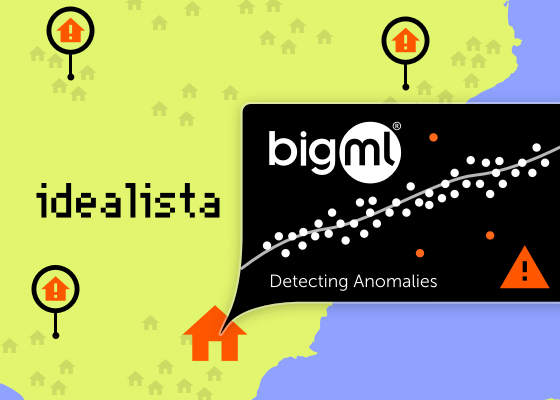
At BigML we love data. Lately, Idealista published this blog post describing some analysis of properties located in some cities of Spain. The data was also included, and was dated 2018. As part of our team lives there and summertime instills a playful disposition, we jumped to our platform to play with it a bit and created some anomaly detectors. This post is merely a description of our work and the results we easily found.

Describing the Data
The repository that was referenced in the post contains several data files, but we focused on the ones that contain sale information, like the ID, price, unitary price, number of bedrooms, etc. They refer to properties located in Madrid, Barcelona, and Valencia and their location is one of the available variables. Unfortunately, the data was not in nice plain CSV files, so even though we are totally partial to Python, we were forced to use R to extract them; but that was a minor setback. Once created, the only transformation we did was removing a geolocation field with duplicated information and we were ready to work.
The Work in the Platform
Starting from one of the CSVs, we dived into BigML. First, we uploaded the three files, one per city, by dragging and dropping them and checked the types inferred automatically in the first one. Only a couple of date fields that were written in a customized format needed some attention, so we configured those to be properly parsed. After that, you just create a dataset that summarizes the information and an anomaly detector to assign the anomaly score, a number that ranges from 0 to 1 to indicate totally normal or very anomalous, respectively. All of this is obtained by using 1-clicks in our Dashboard (no code needed!).
Understanding the Anomalies
Each file has its own outstanding anomalies, and every anomaly is considered so because of a different set of reasons. The following image shows a list of the highest anomalies found in the Valencia_Sale.csv file. The example describes the fields that contributed more to the first found anomaly, which are shown in the right column: being a duplex with a north orientation, a doorman, a terrace, and a swimming pool.

That property is not certainly the usual flat that one can find in Valencia. Looking at the rest of the attributes of that property one discovers that is an isolated house with air conditioning, a lift, a box room, and a wardrobe, so it really stands out from the rest of the crammed flats of a dense city. Looking at the remaining top anomalies, all of them refer to duplexes, most of them studios, with lots of commodities, so our anomaly detectors found mainly uncommon luxurious flats or houses.
Anomalies Distribution
We’ve discussed some of the relevant anomalies that we detected in the data and their individual properties, but we know nothing so far as to their distribution of those anomalies. Do they group under some conditions? To analyze that, we simply compute a batch anomaly score in 1-click. That adds a new column to our dataset, containing the anomaly score for each row. Their distribution can then be drawn as a histogram, showing how there’s a small tail of quite anomalous properties for sale.

In all cases, the tail seems to start around 0.6 and those rows with higher values will be the ones that we consider anomalous.
Our Summer App
Following the summer spirit, that inspires us to engage in all sort of projects, we decided to build an app to show up those results. Having the location for those properties, we were curious to know whether these anomalies were distributed evenly throughout the city or, on the contrary, appeared more frequently in some neighborhoods. Geolocation might be helpful, so we just downloaded the batch anomaly score dataset and used Streamlit and Mapbox to create a simple visualization on a map.

And voilà! We see that anomalies appear more frequently in some neighborhoods. For instance, in Barcelona we see them in the upper side town, where luxurious flats and houses were built, or in the sea shore. The latter also happens in Valencia, where we find them in and old poor neighborhood by the sea side that is recently being gentrified. The distribution of anomalies on a map (or even through windows of time) is an interesting indicator of changes and is a meta-anomaly insight by itself. If you are acquainted with any of these cities, you might want to check the live app here.
My Summer Notebook
Analyzing this data has been a refreshing project that took just a small amount of time and led to a nice example of what anomalies information can reveal. In fact, the automation provided by the BigML platform via scriptify helped us to reproduce the process done by point-and-click in the Dashboard on one of the files to the rest. Using that we could repeat it in parallel and at scale for every city. Of course, we need to walk the last mile and bring the information given by the Machine Learning models to the domain environment, in this case the city maps. This integration in the domain of application is sometimes key for the users to see the real power of Machine Learning models… and in this case, it was also fun to do and nice to look at!


